Background & Challenge
Crystal Springs® has never had a problem attracting customers who enjoy their home and office bottled water delivery service. But as more consumers began placing their orders and scheduling service online, it became increasingly clear that the user experience was not only confusing and counterintuitive but also interfering in the conversion process. With our depth of interactive experience, we saw an opportunity to help Crystal Springs by creating a simplified, modern site design that would make the purchase path foolproof – one that could feature a dynamic “breadcrumb trail” approach to streamline the user experience.
Our Approach
With a brand new site design that was also mobile-responsive, we simplified the checkout process by first summarizing the purchase path on the front end in three easy-to-understand steps that explained how bottled water delivery service works.

Along the way, we built in frequent calls to action, navigational breadcrumbs to allow for greater site flexibility without losing information, a cart summary and the ability to offer special promos, plans and products. With all of the new changes in place, we helped Crystal Springs® reduce and clarify the overall number of steps to close sales – and make good on their mission to create customers for life.
Wireframes
Creating the best user experience possible meant starting at the very beginning. With a series of highly detailed wireframes that mapped out the consumer purchase path, we were able to identify where unnecessary steps could be eliminated or additional information could be added to enhance the overall experience.

A New Doorway
Welcoming a potential consumer to the new purchase path was key to setting the tone for what they could expect. Information here had to be simple, streamlined and straight to the point to illustrate how easy the process would be.
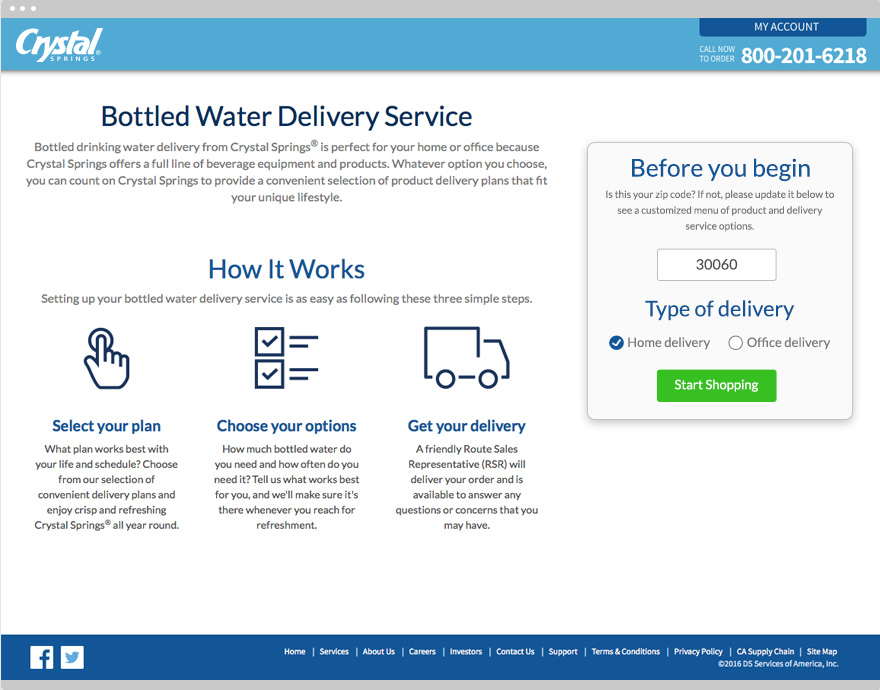
How It Works
In three simple steps, we were able to break down the essentials of what to expect when setting up bottled water delivery service. This element of the project was critical – after all, here is where the brand would set expectations for everything to follow once a consumer began the journey.
Responsive Design
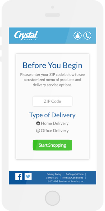
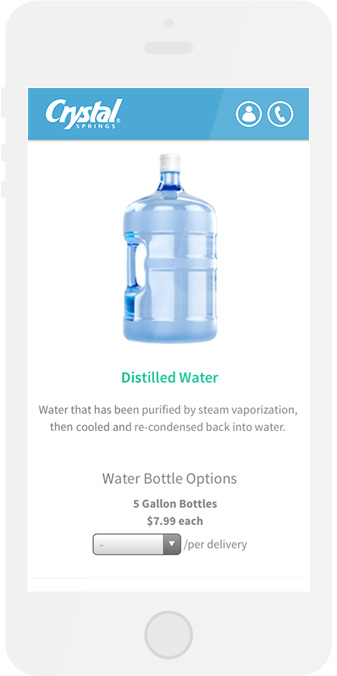
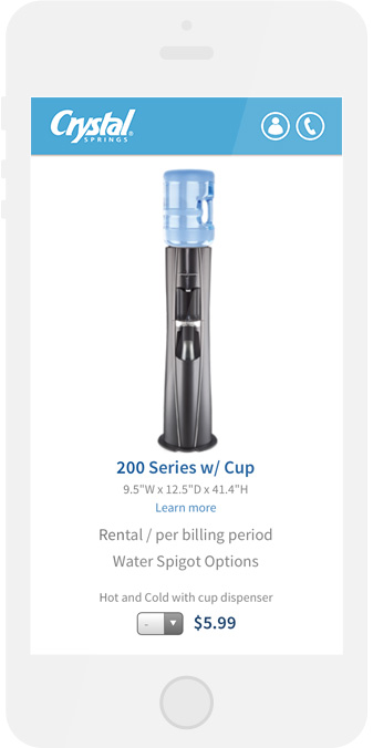
With more consumers making online purchases with their smartphones and tablets, ensuring the site design would render correctly in a mobile environment was key. Accordingly, design choices were made to facilitate the best user experience for both desktop and mobile users.
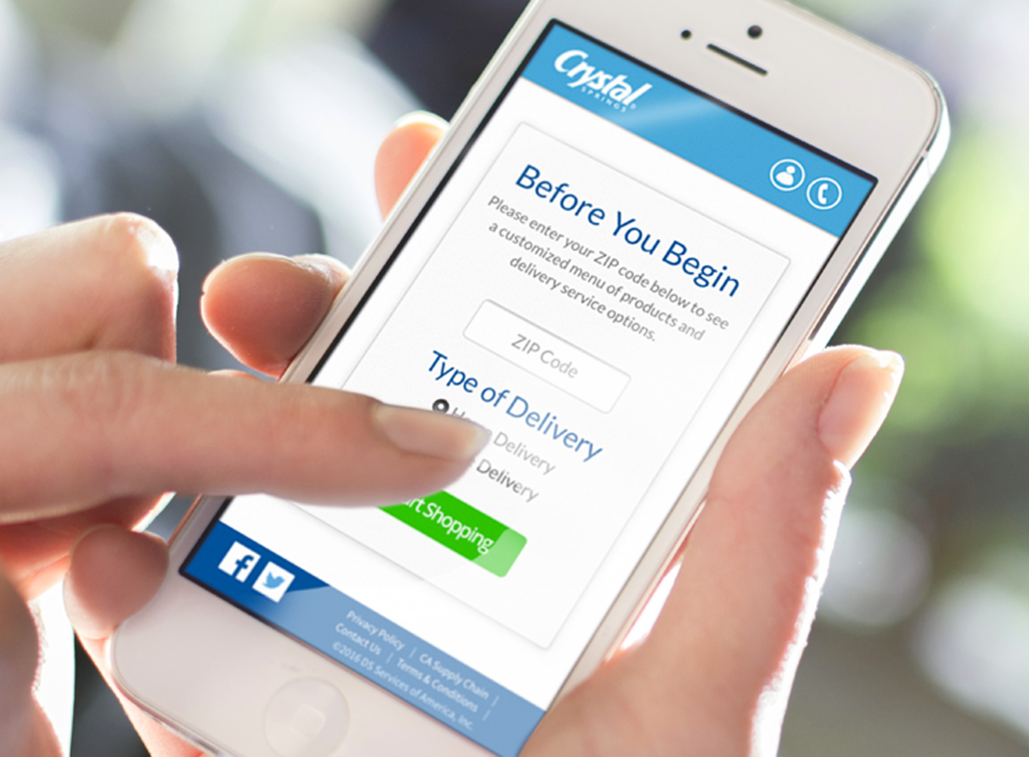

A Nonlinear Step Process
Understanding that every consumer is unique and may not move through the purchase path in a linear fashion, we made sure that information entered on one page wouldn’t disappear if they jumped around on the various steps.


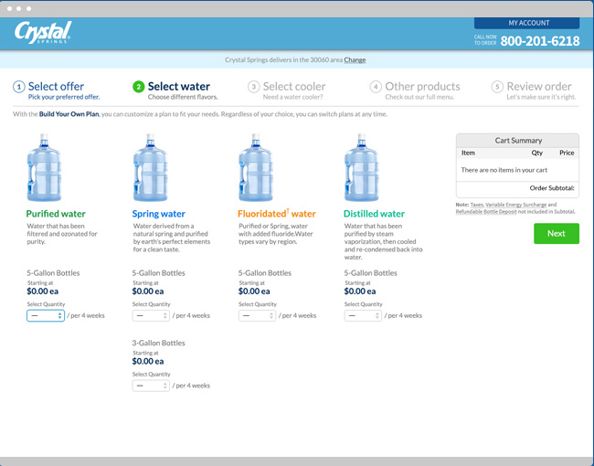
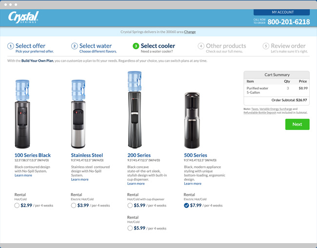
Reduced Complexities
A “build your own path” breadcrumb trail helped to streamline the ordering process with easy-to-understand options that would intuitively usher a consumer through the purchase path as they made plan, water and equipment selections.
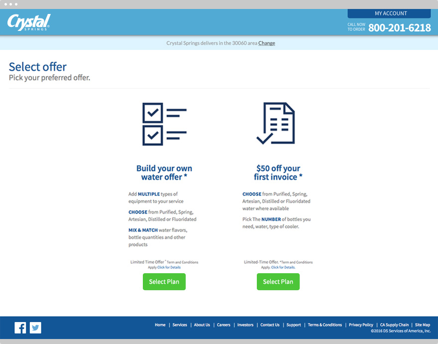
Less Offers but More Options
Too much information can be overwhelming, especially in an online environment. Key to simplifying the purchase path for consumers was weeding out multiple offers that often felt confusing and instead helping to zero in on the best options per category.
Simplified Checkout
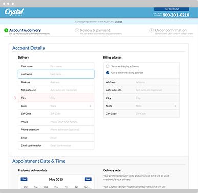
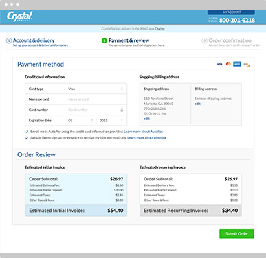
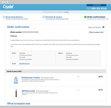
With plan, water and equipment selections finalized, the most important step for consumers is the transactional stage. By taking a critical look at the checkout process, we helped to break down and simplify this final stage with easy-to-navigate screens that displayed detailed information for account details, payment, and review and order confirmations.
Account & Delivery
Payment & Review
Order Confirmation
Measured Results
How can a project be called successful unless it can be quantified through measurement? Since we begin with the end in mind, we designed the purchase path user experience to improve conversion, increase engagement and decrease bounce rates. This is what guided our layout, placement of buttons and calls to action. The results were immediately apparent, and we toasted our glasses to success! Here’s how our client’s site performed as a result:
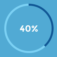
Lift in Conversion
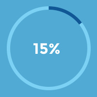
Increase in Engagement
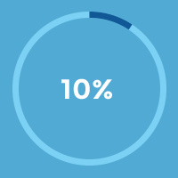
Decrease in Bounce Rate

Connect with us.
Come check us out in the historic Marietta McClaren Mill. We’ve always got some coffee brewing and plenty of space to stretch out and chat about your business needs. Or if you’re short on time, you can just drop us a note here and say hey.
